A landing page is a single-page website with one goal: a sale, a subscription, or a lead generation form. Unlike a multi-page website, a landing page guides the visitor to a single CTA button through the structure: USP → benefits → social proof → form.
Next—why this structure works, how much it costs to implement, and why simply having a landing page doesn’t guarantee anything.
What Is a Landing Page: Definition and How It Works
Imagine a simple scenario. A person is scrolling through their feed and sees an ad for an online course. They click on it and land on a page that has literally just a few seconds to prove that this particular offer is worth their time and money.
This is a landing page. Its purpose isn’t to tell the user about the company in general, but to guide a specific person toward a specific action: leaving a phone number, buying a ticket, or signing up for a newsletter.
 The key feature of a landing page is a single, clear goal. One page, one offer, one button. If a page simultaneously promotes three different services and asks visitors to subscribe to a newsletter, the user gets confused—and none of the goals are achieved.
An important nuance: technically, a landing page doesn’t have to be a standalone single-page site. A section on a large website also fits this definition if it has its own specific goal and its own call to action—for example, a job listings page or a section featuring a promotional offer.
How a landing page differs from a regular website
| Criterion | Landing page | Multi-page website |
| Purpose | One specific action | General introduction to the company |
| Structure | Single vertical scroll | Many pages and sections |
| Navigation | Minimal or none | Branched menu |
| Lifespan | Often tied to a campaign | Long-term |
| Audience | Niche, targeted to a specific ad | Diverse |
A standard website provides an overview of the business as a whole: it includes sections about the company, a service catalog, and a blog. A landing page, on the other hand, focuses on a single offer and guides the visitor through a single path—from the headline to the contact form.
That’s why a landing page works best for short-term promotions, new product launches, or testing a hypothesis—to see if the market is even interested in this offer—before investing in a full-fledged website.
Types of Landing Pages: Which One to Choose
Landing pages differ not only in design but also in purpose. There are three main types.
 Product (advertising) landing page. Leads to an order button. The entire page consists of product specifications, benefits, price, and a purchase form. This is suitable when you’re selling a single product or a small product line with variations—for example, a course with several pricing tiers.
Lead-generation landing page. The goal is not to make a sale, but to collect contact information. Instead of a payment form, there’s a form with a minimal number of fields: name and phone number or email. Often, a bonus is offered in exchange—a free guide, webinar, or trial lesson.
Informational landing page (business card). It doesn’t sell anything directly, but rather sparks interest in the company or product and directs visitors to the main website. It’s used less frequently than the first two types, but is appropriate for branding campaigns.
Quiz landing pages deserve a separate mention—these are questionnaire-style pages where the user selects product or service parameters step by step and receives a personalized offer at the end. This is a type of lead landing page with higher engagement.
Choosing the type is the first decision you should make before starting development: it determines the structure, the content of the form, and the metrics you’ll use to evaluate the results.
The Structure of a Sales-Oriented Landing Page: Conversion-Driven Sections
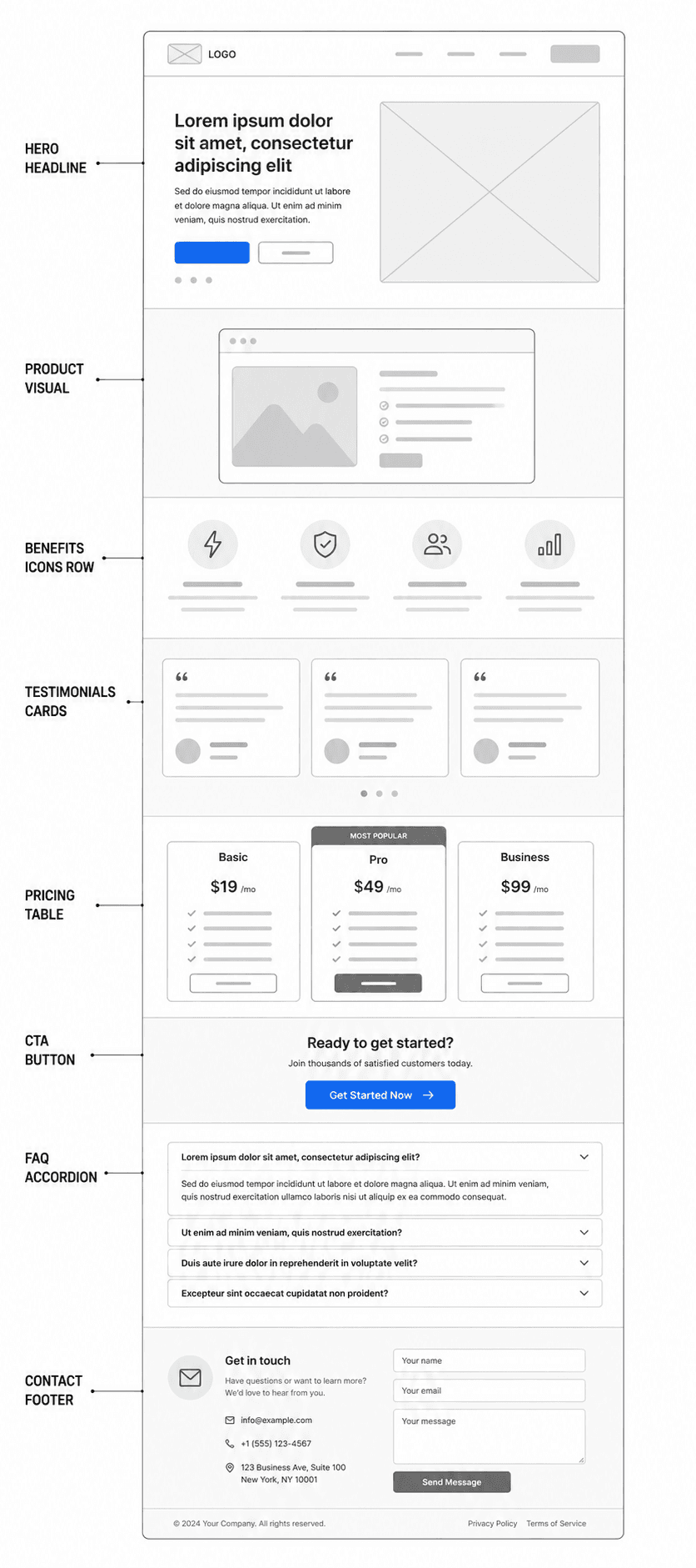
A good landing page isn’t just about a beautiful design—it’s about the sequence of blocks, each of which serves a specific purpose.
- Heading and subheading. The first thing a visitor sees. The heading summarizes the essence of the offer in 5–7 words, while the subheading provides context.
- Unique Selling Proposition (USP). Explains why visitors should choose you. Today, true uniqueness is rare: in most niches, competitors offer similar products or services. Therefore, your USP should be framed not around “uniqueness,” but around a specific problem your audience faces and how you solve it.
- About the product or service. Features, use cases, visuals, or videos.
- Benefits. A brief list of how you’re better than the alternatives—specifically, without vague wording.
- Who it’s for. A description of your target audience and their pain points—this helps visitors recognize themselves in the description.
- Pricing. Transparent pricing or a pricing table with the most popular option highlighted.
- Social proof. Real reviews with photos or links to profiles—no stock photos of “smiling customers,” as this is immediately obvious and undermines trust.
- Application or payment form. Keep mandatory fields to a minimum. The fewer fields visitors have to fill out, the higher the form’s conversion rate.
- FAQ. Addresses common objections before they even cross a visitor’s mind.
- Contact information. The final section that confirms the company’s legitimacy.
This framework doesn’t necessarily have to span the entire screen according to a set formula. If you can convey your offer within a single screen—that’s a fully functional landing page, and there’s no need to artificially extend it.
CTA and USP: Two Elements Without Which a Landing Page Doesn’t Work
A call to action (CTA) is a button or element that directly tells the visitor what to do next. Without a clear CTA, even perfect copy remains just copy.
The difference between a weak and a strong CTA lies in specificity. “Learn more” is vague and doesn’t motivate. “Schedule a consultation,” “Get started for free,” “Get a quote within 24 hours”—these are specific actions with an obvious result.
Placement matters too: You should repeat the CTA several times throughout the page—after the USP, after the benefits, after social proof—but it’s best to vary the wording slightly in each place so the blocks don’t look like copies of each other.
The USP works in tandem with the CTA: first, you explain why someone should choose you, then you provide a button that turns that decision into action.

How Much Does It Cost to Develop a Landing Page
The cost of developing a landing page in Ukraine varies quite widely—from about $400 to $1,200 and up, depending on several factors.
What affects the cost:
- Template or custom design. Developing a site using a ready-made template is significantly cheaper and faster than creating a unique, brand-specific design.
- Number of languages on the site. A single-language landing page is cheaper than a multilingual one.
- Functionality complexity. A simple contact form comes with one price; integration with a CRM, quiz logic, or online payment comes with another.
- Who does the work. A freelancer using a website builder versus a full-service agency that includes competitor analysis, copywriting, and SEO optimization—these are different services at different prices, even if the end result looks similar.
So when you see quotes ranging from $200 to several thousand dollars for “the same” landing page—the difference is almost always not in the quality of the “domain or hosting,” but in the amount of work that goes into the final file.
How long does it take to create a landing page?
The timeframe also depends on the approach:
- A ready-made website builder template—from a few hours to 1–2 days, if you only need to replace the text and images.
- Development with content creation and basic customization—approximately 2 weeks.
- A full cycle including niche analysis, prototyping, unique design, and testing—3–4 weeks.
The quick option is suitable for testing a hypothesis: whether the market is even interested in the product. The full cycle is justified when a significant advertising budget is at stake and the page needs to handle high traffic volumes.
Stages of landing page creation: a step-by-step process
- Defining the goal and target audience. What exactly should the visitor do, and who is this person?
- Competitor analysis. What offerings are already on the market, and how do you differ from them?
- Formulating the USP and structure. Page prototype—which sections and in what order.
- Content creation. Text, photos, and videos.
- Design. Visual layout of the structure, taking into account color psychology and visual hierarchy.
- Development. Layout, form integration, and mobile optimization.
- Testing. Verifying forms, loading speed, and correct functionality across different devices.
- Launch and further optimization. A/B testing of headlines, buttons, and images after traffic begins.
This last point is often overlooked, even though it’s what transforms an average landing page into a truly effective one: the first version of the page is a hypothesis, not the final version.
Who Should Use a Landing Page, and Who Shouldn’t
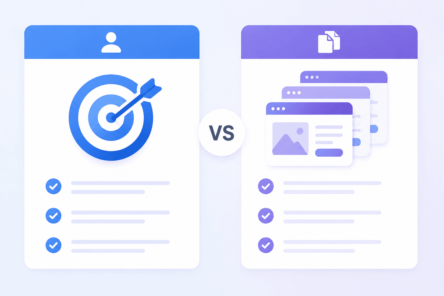
A landing page is appropriate if:
- you’re selling a single product or service, with at most a few variations;
- you have a short advertising campaign or a one-time event;
- you need to quickly test whether your product interests your audience;
- your goal is to build a contact list for future use.
A landing page isn’t the best choice if:
- you have a wide range of products or services (an online store is more appropriate here);
- your goal is long-term brand building and trust-building (this requires a full-fledged website with a blog and a detailed company description);
- the product is already well-known in the market, and the main competitive advantage is the company’s reputation, not just a single successful offer.
The Hard Truth: Why a Landing Page Alone Doesn’t Sell
Here, it’s important to be honest, not just promotional.
A common misconception: a well-designed landing page alone can turn any visitor into a buyer. That’s not true. If someone who doesn’t need the product at all lands on the page, no design and no “magical” structure will convince them. A landing page doesn’t create demand—it helps those who are already interested make up their minds.
Second: without traffic, a landing page is just a file on a server. The page doesn’t attract visitors on its own. You need advertising, SEO, or another channel that will bring in the specific audience for whom the offer is written.
Third: the average conversion rate for sales-oriented landing pages is usually in the range of about 2–5%. Conversion rates of 10% or higher do occur, but this is more of an exception for highly niche offers with very precise targeting, rather than a typical result. If a contractor promises a guaranteed 20–30% conversion rate with no caveats, that’s a reason to ask further questions.
And one last thing: no copywriting formula—neither AIDA nor countdown timers—can compensate for a weak offer or an incorrectly chosen audience. Formulas structure the presentation, but they don’t replace the essence of the offer.
Common Mistakes When Creating a Landing Page
- Slow page loading. Every extra second of waiting means lost visitors who simply close the tab.
- A complicated sign-up form. More than 4–5 fields significantly reduce the number of completed forms.
- Lack of mobile optimization. Most traffic today comes from mobile devices—incorrect display on a smartphone immediately costs you a portion of your conversions.
- Irrelevant or vague content. Text that “goes nowhere” and fails to address the audience’s actual questions.
- Confusing navigation or unnecessary distractions. A landing page should lead to a single action, not offer ten different options.
- Fake reviews. Stock photos with captioned names are immediately noticeable and are more likely to undermine trust than to build it.
Conclusion
A landing page is a highly targeted tool with a single purpose, not a one-size-fits-all solution for any business. It works well for testing hypotheses, short campaigns, and lead generation—provided it has a well-thought-out structure, a clear USP, and, most importantly, real traffic from the target audience.
Design and structure are important, but they reinforce a good offer—they don’t create demand where none exists.