Why does aesthetic visuals win awards but fail to generate leads? Find out how cognitive biases, proper UX design, and color psychology can double website conversions by subconsciously pushing users to buy.
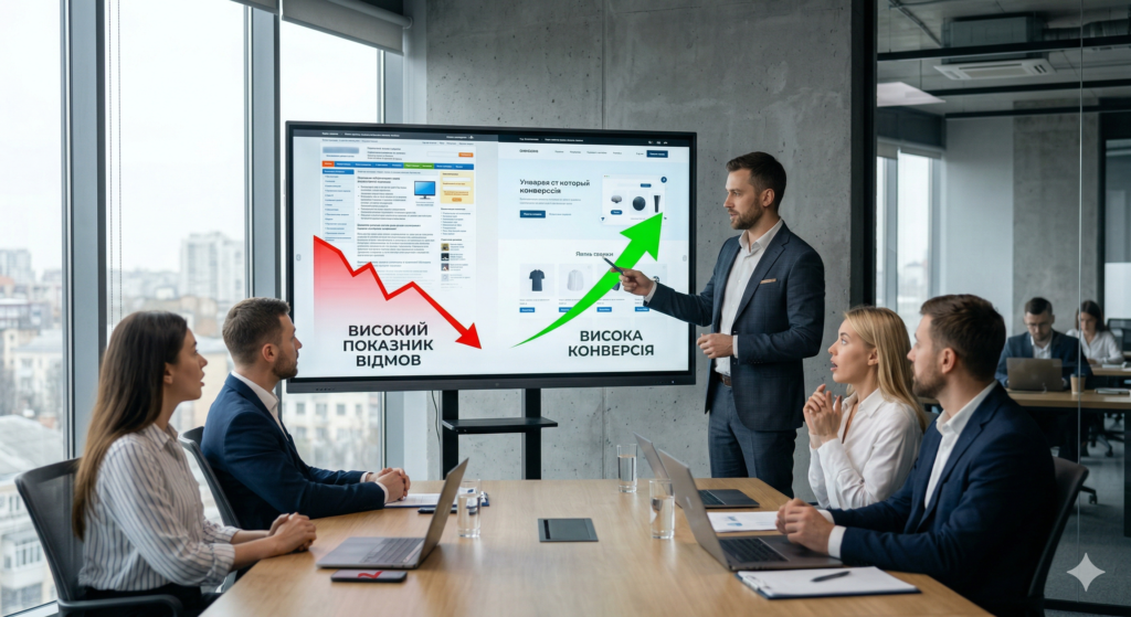
Sound familiar? You’ve commissioned a stylish, modern website, the designers have won awards at Awwwards, but the sales team is sitting idle? Traffic is coming in, but users just look at all that beauty and close the tab. Call-to-action (CTA) buttons have a zero CTR, and the site’s conversion rate is hitting rock bottom.

The problem is that aesthetics don’t equal sales. When visuals are created without considering how the human brain works, they become just a picture. To turn a viewer into a buyer, neuromarketing must come into play in design.
What is neuromarketing and how does it boost conversion rates
Neuromarketing studies a person’s subconscious reactions to marketing stimuli. In web development, this means using visual triggers that direct the user’s attention and nudge them toward the desired action without aggressive pressure.
People make decisions based on emotions and only later justify them with logic. Proper UX/UI design works specifically with the emotional part of the brain.
4 cognitive biases that dramatically increase CTR
Cognitive biases are systematic errors in thinking. When skillfully integrated into the interface, they become powerful sales tools.
1. Hick’s Law: Choice Paralysis
The more options you offer, the longer it takes a person to make a decision. And on the internet, “long” means “never.”
- Limit the number of items in the main menu to 5–7.
- There should be only one priority CTA on a single screen.
- Don’t make the user think—lead them by the hand.
2. Social Proof (Herd Effect)
The brain conserves energy: “If hundreds of people before me have chosen this, then it must be safe.” Add real numbers to the page: “1,450 students have already taken this course” or reviews with photos of real customers. This instantly breaks down barriers of distrust.
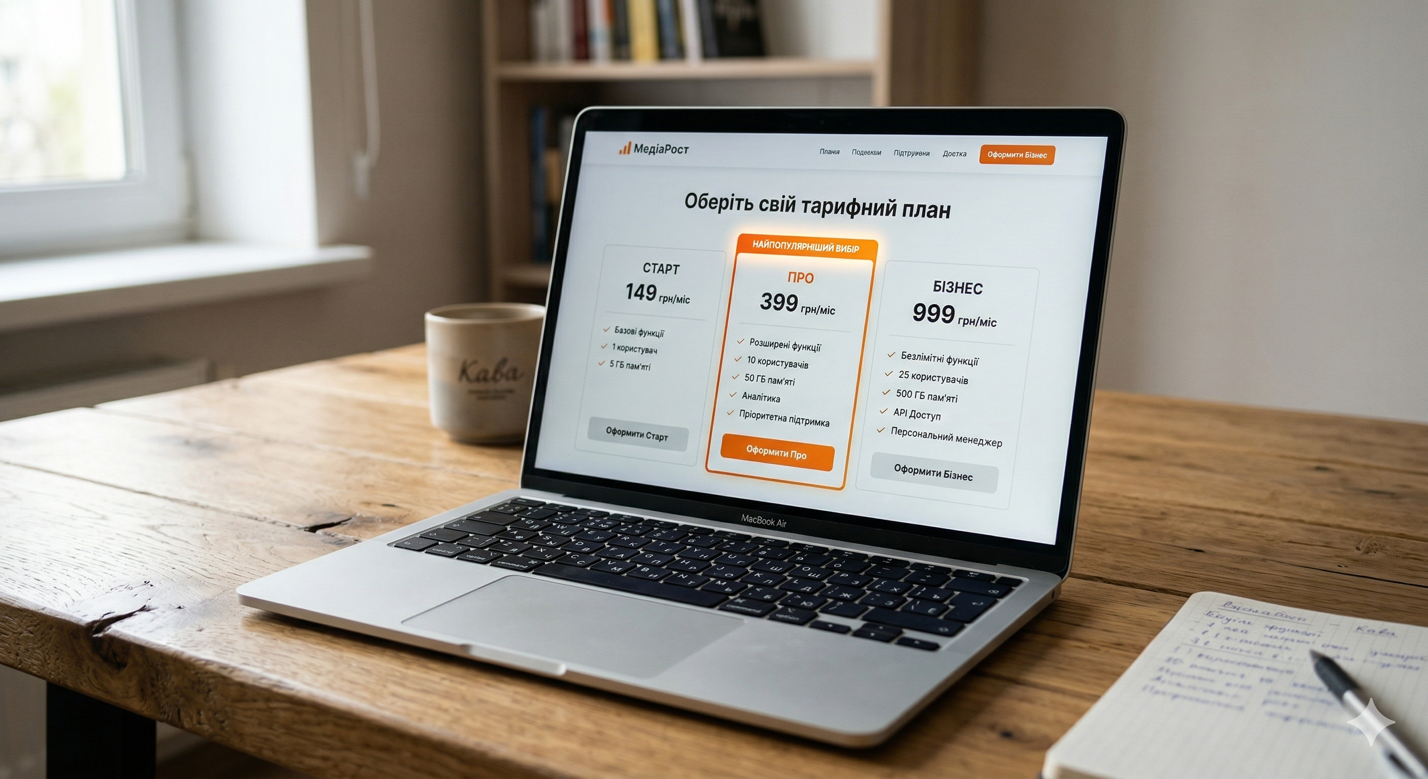
3. Anchoring Effect (Anchoring in Pricing)
People evaluate value not in absolute terms, but relatively. That’s why crossing out the old price or listing the most expensive plan first (from left to right) makes the average price much more appealing. The subconscious latches onto the first number and compares all subsequent ones to it.
4. The Scarcity Effect (FOMO – Fear Of Missing Out)
The fear of loss is stronger than the desire to gain. Countdown timers, messages like “Only 2 spots left” or “Running out of stock” encourage quick decision-making. The main rule is that the scarcity must be real; otherwise, you’ll lose trust.
Color Psychology: How to Manage Emotions
Color is the first signal the brain picks up. Color psychology directly influences whether a person clicks a button.
- Blue: Trust, security, intelligence. Ideal for banks, IT companies, and medical centers.
- Red: Energy, urgency, aggression. Use sparingly for promotions and CTA buttons to grab maximum attention.
- Green: Calm, growth, sustainability. A classic choice for confirming a successful action or for financial products.
- Contrast: A button doesn’t have to be bright. It should be the most contrasting element on the screen. If the entire site is blue, make the CTA orange.
Reading Patterns: How We Scan Websites
Users don’t read text online—they scan it. Neuromarketing research (eye-tracking) confirms the existence of two main gaze paths:
The F-pattern works for pages with a large amount of text (blogs). The gaze moves from left to right across the first few lines and then drops down. Important information and keywords should be at the beginning of paragraphs.
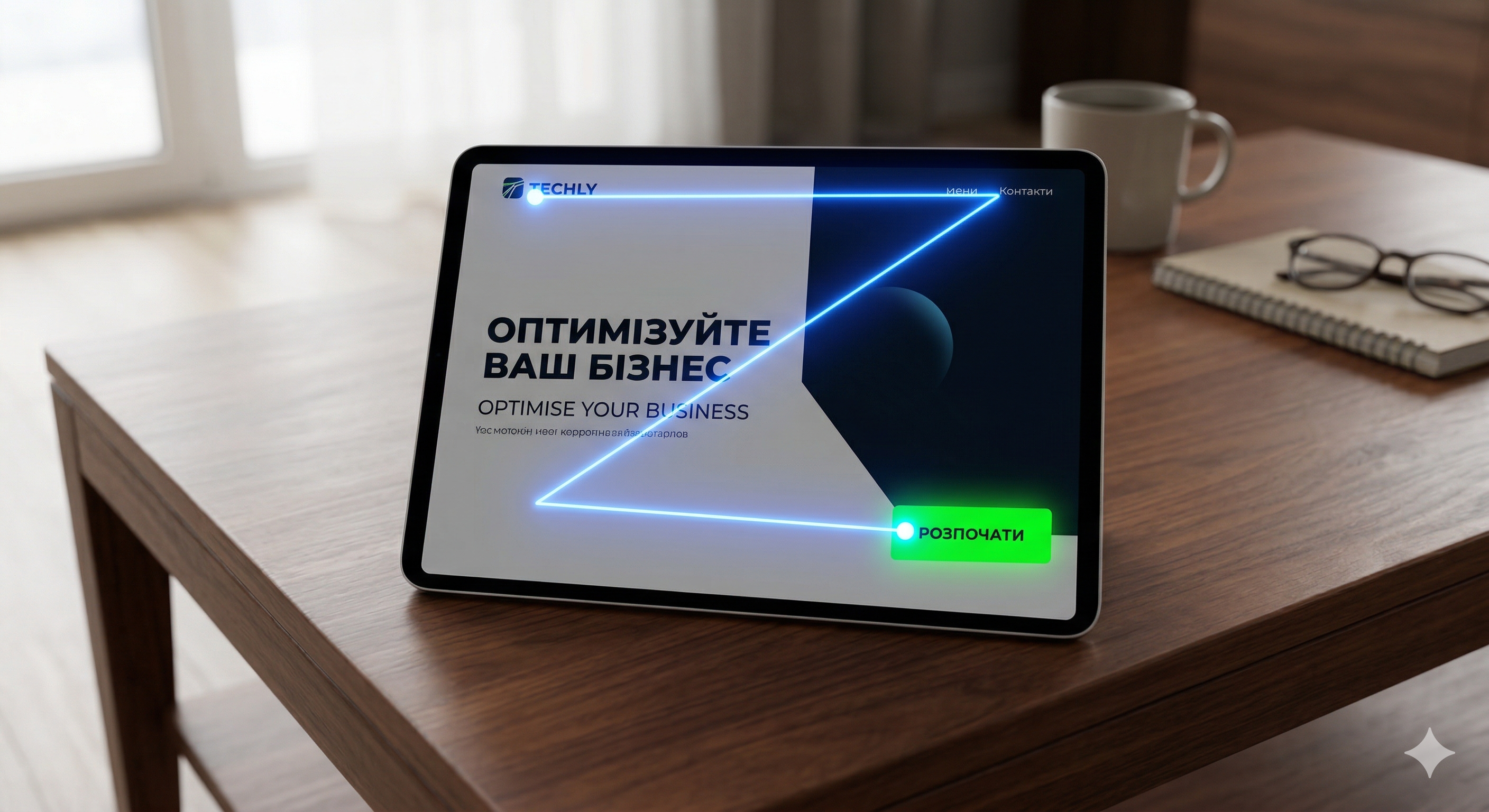
The Z-pattern is ideal for landing pages. The gaze moves from the logo (top left) to the contact information (top right), diagonally down to the headline/offer, and then to the CTA button (bottom right). Place your main elements along this path.
Make your design a sales tool
Stop wasting marketing budgets on a website that just “looks nice.” It’s time to create a tool that will address objections before they even enter the customer’s mind.
The experts at FullPage.agency combine cutting-edge UI trends with a deep understanding of the psychology of choice. We’ll design an interface that’s guaranteed to boost your sales.
Order an audit of your website or a custom build from scratch, and we’ll show you where you’re losing leads!